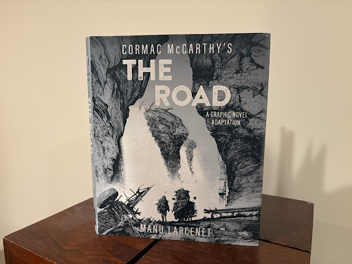
In 2024, French cartoonist Manu Larcent released his graphic novel adaptation of The Road. I was already familiar with Cormac McCarthy’s original after reading it over the summer for AP Lit, and I did end up really liking it. This adaptation caught my eye after I saw that it won the 2025 Eisner Award for Best Graphic Novel Adaptation. After checking it out, I would personally say that I prefer it to the original, but your mileage may vary depending on what you want.
The art is excellent throughout. It perfectly conveys the gloomy atmosphere of a post-apocalyptic world. There are a lot of panels dedicated to just the scenery, and the art’s high quality stops this from feeling repetitive. When the art becomes more character focused, everything about the character is clear on a per panel basis, and there was never a moment where I was confused about what was happening from one panel to the next. Color is used to great effect, with mostly monochromatic pallets being used to get across the mundanity of survival in the setting, although extra color is sometimes added for more major moments. Even if you are a McCarthy purist and are offended by any change an adaptation makes to the story of his books, this adaptation is worth it just for how well it gets the feeling of the world across alone.
A problem that I have with major adaptations of works is that often their visual style becomes the norm for future adaptations. An example of this would be The Lord of the Rings, where the art and animation before the live action movies were much more diverse than what came after, because those movies became the default look of that world. Because The Road has previously been adapted into a movie, I wondered if this graphic novel would take any cues from that. This wasn’t the case at all, explained at the end of the book by the inclusion of a letter from Larcent to McCarthy, where he specifically mentioned trying to avoid referencing the movie version. This benefits the book because by not taking influence from something real, it is able to be much more expressive. In the movie, the man and the boy had to carry a reasonable amount of stuff that someone could realistically hold, while in this book their cart is way overstuffed, and they both still carry an excessive amount on their backs while also being mostly covered head to toe. The large amount that the two main characters carry and wear is contrasted by how horrifically skinny and frail they both are. One final thing that I want to note is that in the movie version, Viggo Mortenson as the man visually looks like what you’d expect a generic rugged Hollywood hero to look like. The book, on the other hand, on top of the man’s already mentioned frailty, makes him balding while also having long hair for most of the story, which is a gross look that works for a character in an environment where he doesn’t have the time or the means to care for himself physically. By completely divorcing itself from the previous adaptation of The Road, this graphic novel is able to build its own visual identity that allows it to create striking images that work best for its medium.
The single most notable change about this adaptation is that it completely omits all narration from the story. I have a feeling that this would probably be the graphic novel’s most divisive decision with fans of the original, because McCarthy is known for his prose. Despite this, I think that this omission served this adaptation well. The only other graphic novel adaptation of a book that I have read is of The Hobbit. David Wenzel’s illustrations in that book are probably my favorite depictions of that world, but so much of the narration is kept that it doesn’t read as well as a comic. I think that because the book exists already, there shouldn’t be this need to have an awkward compromise between having things play out as a traditional comic and jamming in as much narration as possible. While Larcent’s The Road loses out on narration that tells you what’s happening, the art allows you to infer what characters are feeling through their posture and facial expressions. Additionally, actions that are stretched out over several panels are given more weight and importance than ones passed over quickly, communicating what you should really be paying attention to without the need for narration. Ultimately, this creates an experience different from reading the book, while getting across the same themes and emotions.
One part of the graphic novel that I personally preferred over the book is how the shocking moments were able to have more impact. The original story hardly places emphasis on anything, which works for most of it, but while reading it took me a second to realize the gravity of moments like the characters coming across large groups of other people or finding the locked basement. This graphic novel doesn’t have that problem at all, because during these moments the colors become much harsher, allowing them to stand out more, and the strangers always looked threatening in a way that made them hard to ignore. Busy panels filled with crowds heavily contrasted the usual sparse ones. While before I at times passed over these moments, here I really feared for the characters’ safety, because of how threateningly these scenes were presented.
While I don’t have the best recollection of the events of The Road, it seems to me that nothing major was cut out. Like most adaptations, however, it does cut things down quite a bit. The man’s dreams were a bigger part of the original, while here I believe their only remnant is him shortly reminiscing about his wife, although there may have been additional moments that I’m forgetting. This change didn’t bother me too much, because I felt that the execution got the same idea across. However, what really did bug me was how shortened the man’s death was. In this case, I think that the point in the original story was that death is this painful and most importantly slow process for the man, so it just didn’t work as well when shortened in the graphic novel.
One minor thing that I liked in the graphic novel is how it utilized word balloons. A lot of comics use word balloons for the bare minimum of getting dialogue across. In this graphic novel, word balloons drastically vary in size based on how loud the character is speaking, and words are sometimes tilted to make the action seem more dynamic. I particularly liked how the man’s wheezing is depicted as a series of word balloons of just “h”. In a similar vein, I liked how panel layouts reflected the events of the story. A notable example of this is when the characters find stability staying in the bunker, and to reflect this the panels become more neatly organized into a grid. This may sound minor, but I like how Larcent uses all tools available to him in the graphic novel medium to adapt McCarthy’s story.
Overall, I think that Manu Larcent did the best job possible at adapting Cormac McCarthy’s The Road into a graphic novel. Instead of being a 1:1 adaptation, it makes changes that work best for its medium, while still mostly staying true to the original. I personally thought that the art more than made up for the complete removal of any form of narration, but I would understand if someone else couldn’t accept that. How this adaptation compares to the original really only comes down to if you prefer comics or prose novels, and I definitely know which side I fall on. Another comic by Larcent is Blast, which he mentions in his letter to McCarthy is similar in its themes to The Road. I would like to read it, but from what I understand it is not available physically in English, so I hope that the success of this graphic novel could get that published one day.